The Art of Type: How Typography Shapes User Experience
Typography is more than just a means of presenting text; it is a vital element that significantly shapes the user experience on digital platforms. By utilizing various font styles, sizes, and spacing, designers can evoke emotions and guide users' attention effectively. For instance, serif fonts often convey a sense of tradition and professionalism, making them suitable for corporate websites, while sans-serif fonts present a modern and clean aesthetic ideal for tech startups. The combination of these elements can enhance readability, making information easily digestible and helping to maintain user engagement.
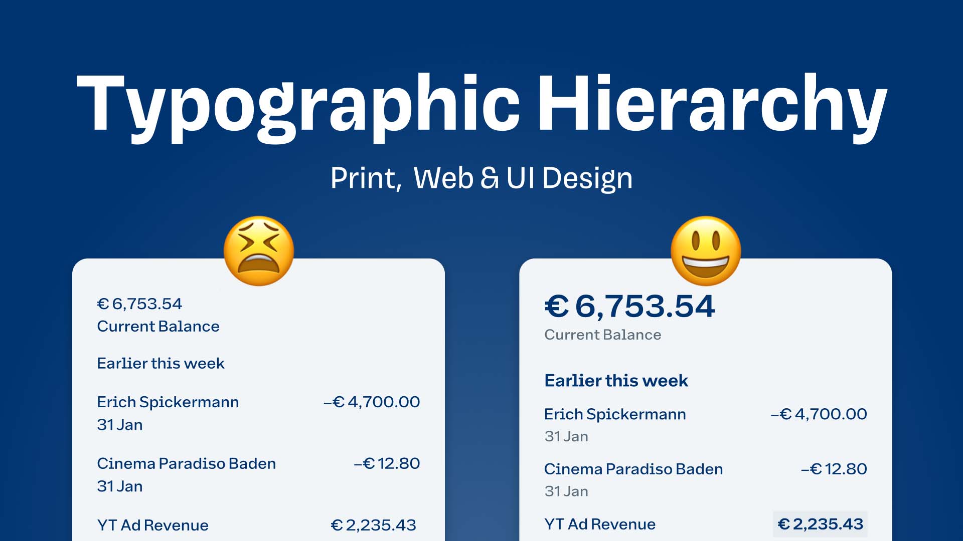
Moreover, the thoughtful application of typography can improve navigation and usability. When headings and subheadings are clearly defined through size and weight, users can quickly skim through content to find what they need. A well-structured typographic hierarchy not only aids in user experience but also contributes to effective SEO. This is because search engines interpret headings as markers of relevant content, thus influencing how information is indexed and displayed. In summary, mastering the art of typography is essential for creating a balanced and aesthetically pleasing digital environment that keeps users coming back.
Typography in Web Design: Best Practices for Readability and Engagement
Typography is a crucial element in web design that significantly affects the overall readability and user engagement of a site. To enhance readability, it is essential to choose a legible font family, maintain appropriate line lengths, and ensure sufficient contrast between the text and background colors. Generally, a line length of 50-75 characters is recommended, as it allows for a comfortable reading experience. Furthermore, employing hierarchy through different font sizes and weights can guide users smoothly through your content, allowing them to quickly identify important information.
Additionally, consider the spacing between letters, lines, and paragraphs, as proper typographic spacing can greatly improve engagement. Implementing a minimum line height of 1.5 times the font size helps in creating whitespace that makes text less dense and easier to digest. Additionally, using bullet points or numbered lists can break down complex information into bite-sized pieces, promoting higher retention among readers. By focusing on these key best practices, designers can create harmonious typographic layouts that not only look attractive but also enhance user experience and interaction.
Why Your Choice of Font Could Make or Break Your Website
When it comes to web design, font choice is often overlooked, yet it can significantly impact user experience and site aesthetics. The right font enhances readability, strengthens your brand identity, and creates an inviting atmosphere, while the wrong choice can lead to confusion or frustration among visitors. Consider that a well-chosen font can evoke emotions and convey your site's purpose, whether it’s a professional tone for a corporate site or a playful vibe for a creative portfolio. Thus, selecting a font that aligns with your brand’s message is crucial.
Additionally, font compatibility across different devices and browsers should be a priority in your design strategy. A font that looks stunning on a desktop may appear distorted on mobile, leading to a poor user experience. Investing time in choosing a responsive font can help maintain your site’s integrity and ensure readability for all users. Poor font choices not only distract from your content but can also hurt your site’s SEO performance, as visitors may leave quickly if they struggle to read text. Ultimately, your choice of font could indeed make or break your website.